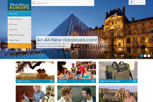
 After over a year of hard work, I’m proud to announce our beautiful new Rick Steves.com website! At the beginning of the development process, my team and I thought a lot about what we wanted out of a new website. After hours of discussion, we circled back to the beginning: our original mission to inspire, inform, and equip Americans to have European trips that are fun, affordable, and culturally broadening. Today I am proud to say that this new website does just that. It’s full of free tools and resources to help you dream about and plan for your next trip. Over next few days, I’ll highlight some of my favorite features.
We’re still tweaking the design, but we feel it’s ready for you to give it a spin. We’re still discussing how to both keep it lively and changing, and at the same time make it an easy-to-navigate almanac of information that our travelers can turn to when planning a trip.
Please take a moment to poke around, and tell me what you think. I’d love to hear from you.
I am getting use to it and like it. I notice in the forum people are not using it as much as the old one. Also on your blog here you cannot really check on your spelling because part of the comment disappear until you have actually posted. Maybe it is my computer, but I have Windows 7. So it should work. Good change.
I love this new website. In fact I like it so much I just bought almost $200 worth of merchandise in the online store. I love watching the TV programs online. This website is the most travel fun you can have without traveling.
I enjoyed exploring the new ricksteves.com.
It is much easier to find the information I am looking for.
But I encountered a problem when I accessed travel blog page.
The captions for the picture are truncated when the browser window width is reduced.
It is problematic especially with my iPad because I can’t increase the browser window width wide enough to show the entire cations. In fact this comment field doesn’t fit in the window on iPad.
The only thing I miss is the ‘European Headlines’ section from the old website. Is it somewhere in the new one?
Substance over style. The comments about cash were timely and worthwhile and a change from a few years ago when we were led to believe credit cards were almost as viable as cash. During my tour I had to change money for tourists who thought their cards would work reliably throughout Spain. Most people will navigate the new RS website just fine but it is the content which will always hold sway over the fancy graphics, speedy access and even the organization.